Retro Sign

I feel like we all go through phases where we spend a lot of time on one hobby and then a new phase where we are less excited about it. Do you know what I am talking about? Lettering was that for me. I started lettering about 7 years ago with varying intensity throughout the years. First I practiced on paper, then got really into drawing on chalkboards, and when I finally got my iPad I was really into trying out designs on it. But for a while now I’ve “only” been making cards for events and the occasional other creative project. For that reason I was even more excited to buy an online lesson on how to draw retro signs by Aurelie Maron and now I am hooked! It’s funny how trying something new can get that old excitement back up! I love drawing in this different style and exploring new options. I was also able to learn a lot more about lettering and the app Procreate in general.
I am excited to share a bit about the creation process with you and I hope you get inspired to create as well! This post is for someone with a bit of experience in lettering and art. If you are new to lettering check out my beginners blogpost here!
Retro Sign
The goal of the art course was to create a retro sign like you could see them in the US in the 1950’s. That includes neon, light bulbs and distinct fonts and shapes. (Shown below.)

Font Sample from Aurelie Maron

Font Sample form Aurelie Maron

Example Shapes for retro signs

Sketches - Skizzen
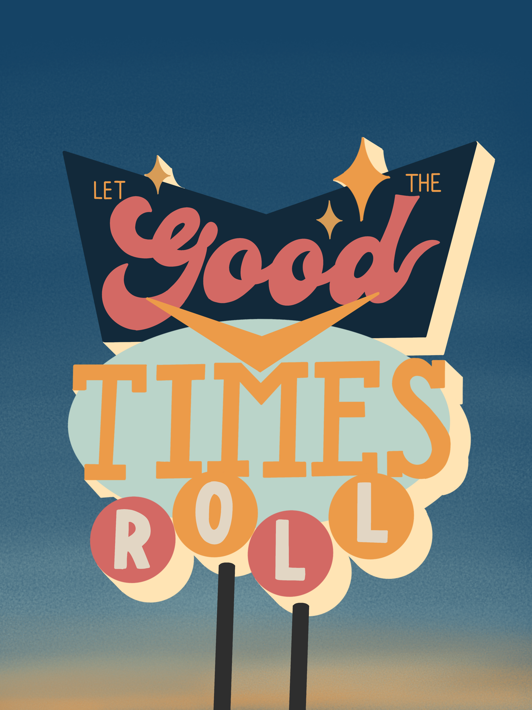
The Draft
Before I took the class I always just made one simple sketch and then used that to keep working. I learned that I should draw a ton of different sketches and also challenge myself to do new stuff and use shapes and letters I haven’t used before. At the end I can choose the sketch I like best and finalize it. Like that I can ensure I chose the best option and I get a lot more different looking art pieces.
The Body
From the pictures below you can see how I got to the final art piece. But here is what I’ve learned along the way: Always draw the full boxes/shapes, even if they are partially hidden behind another design. (For example: the oval behind Times) It makes it way easier to move things around and to create shadows.
I also learned to use the tool “clipping mask” when used, whatever you draw will only show up on what’s drawn on the layer below. I use it when I want to draw a shadow or texture onto something but still want to be able to edit it afterwards.
Details
It was very helpful to see for me that adding details, shadows, and lighting really brings a design to life. Before, the art piece might seem flat and unrealistic but adding details makes it amazing.

Final Sketch

Outlines

3D

Adding Color
Final Color Choice

Texture and Shading

Prepare for light and add highlights
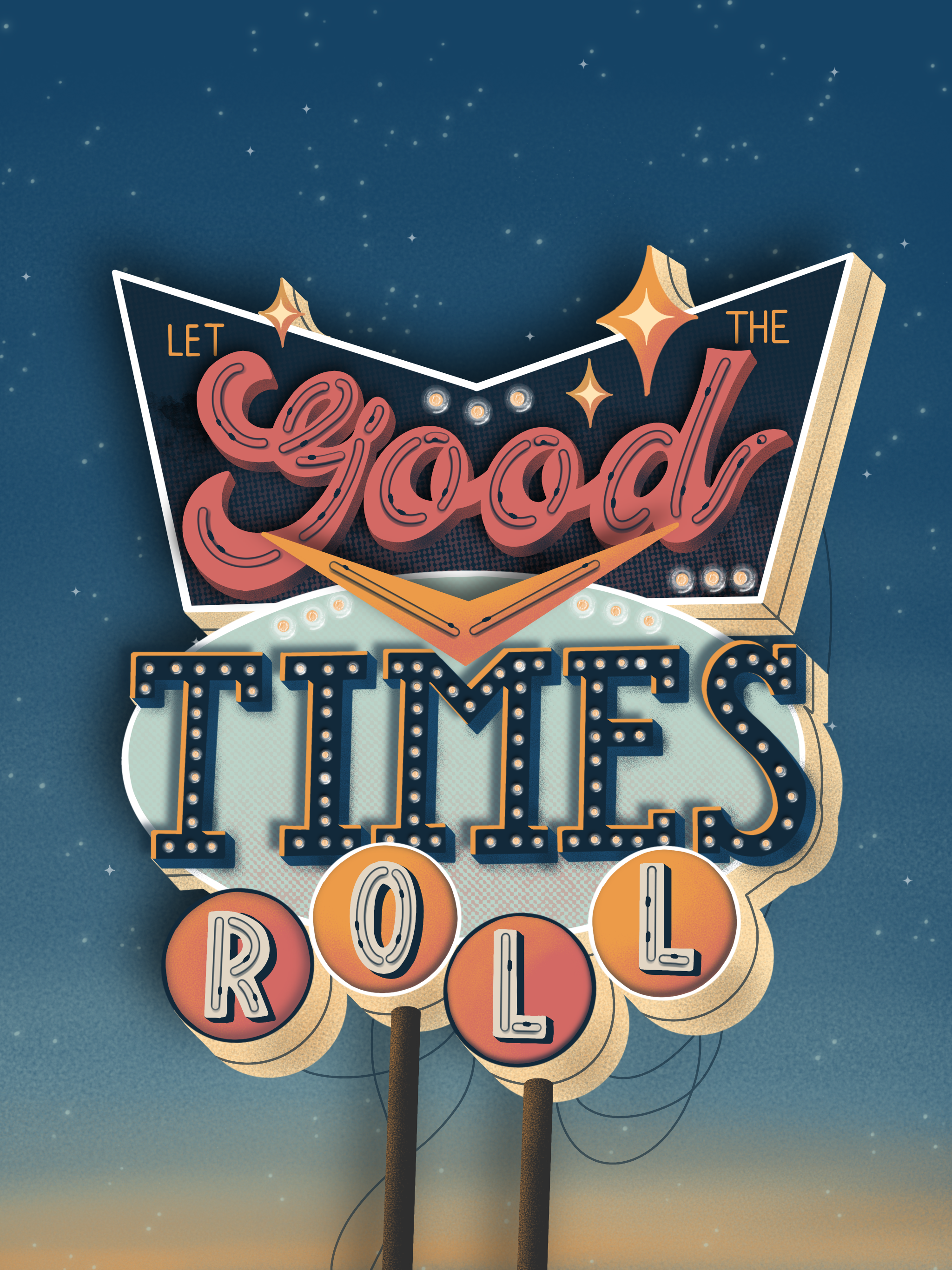
Add lightbulbs

Add lights and finished